Review - Peter's Date Package 1.1
Date Published: 08 April 2005

Introduction
I have been meaning to do a review of Peter’s Date Package for quite some time, and finally got around to it a few weeks ago. I had figured on the review only taking me a relatively short amount of time, because I needed to use some date selection controls in an application I was building. I figured I’d use Peter's controls, write what I thought about them, and kill two birds with one stone. Unfortunately, it wasn’t quite that easy, because this date package includes a lot more than just a couple of date selection controls. To do justice to the product, I had to spend time with each control, and put the complete collection through some tests.
The following controls are installed with Peter's Date Package 1.1:
- DateTextBox
- MonthYearTextBox
- AnniversaryTextBox
- DateTextBoxValidator
- DateTextBoxMinMaxValidator
- DateTextBoxCompareValidator
- DateTextBoxDifferenceValidator
- UnselectedDatesValidator
- CS_Calendar
- PopupCalendar
- MonthYearPicker
- PopupMonthYearPicker
- SpecialDates
- QuickDateMenu
- TimeOfDayTextBox
- DurationTextBox
- TimeTextBoxValidator
- TimeTextBoxMinMaxValidator
- TimeTextBoxCompareValidator
- ContextMenu
All told, there are 20 controls, of which 7 are validators specially designed to validate the date and time controls. For this review, I’ll go over the installation and licensing experience first, then cover the capabilities of these controls, and wrap up with my overall recommendations. You may also want to read another review by Brian Desmond, completed in October 2003.
Installation and Licensing
Peter’s Date Package is available as a web-based download. Accompanying the installer file, which is about 1.5MB, should be an email detailing your license key and user ID. Running the PDPInstaller.msi installer file will set up Peter’s Date Package on your system. Before you can use the controls, you need to copy the license file to the appropriate folder and reference the license key in your application’s Application_Start method. Both of these steps are detailed in the User's Guide PDF. The User's Guide is quite impressive, weighing in at 190 pages and covering nearly every typical scenario and question that you will have as you get going with these controls.
These controls offer several varieties of licensing, to fit the needs of different organizations. You will find them detailed here. At a base price of $50 per server, the controls are a steal, because developing any one of them with comparable quality and attention to detail would take several days at least (more likely weeks or months), and most .NET developers skilled at building custom controls make more than $50 per hour.
Installation and licensing setup is covered in the User's Guide on pages 16–18. Basically all you need to do is drop the .lic file you received via email into the licenses directory under your InetPub\wwwroot\aspnet_client directory. Then, in your Application_Start method, add the following line:
PeterBlum.PetersDatePackage.Globals.Licensing="[your license key]";Once these simple steps have been completed, it’s easy to use the controls on your ASP.NET pages. In VS.NET, the controls have nice design-time views, and provide a wealth of properties that enable you to customize their behavior and appearance. If you want to use the default look of the controls, you will need to add the following line to any page on which you use the controls:
<link href="/aspnet_client/PetersDatePackage/Appearance/Stylesheet1.css" type="text/css" rel="stylesheet" />DatePickers
As I already mentioned, this package comes with a few different date and time controls. The most popular of these, and the one which prompted my interest in the suite, is the DateTextBox control. In addition to the DateTextBox, the suite includes a MonthYearTextBox and an AnniversaryTextBox.
As an aside, I’ve recently been working with Paul Wilson’s UIMapper.net framework, which includes a DatePicker widget based on the ASP.NET Calendar. If you’ve used the ASP.NET Calendar as a datepicker, you will know that it’s somewhat lacking. I was able to incorporate Peter’s DateTextBox into Paul’s UIMapper code in about ten minutes, and it worked beautifully. I think you’ll find that integrating Peter’s controls into third party tools will be no more difficult than integrating the built-in WebControls, provided the third party has architected their solution to allow for such integration.
DateTextBox
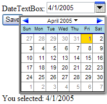
The DateTextBox consists of a TextBox control that has been heavily modified to include a dynamic pop-up calendar that populates the contents of the TextBox. It also features a ContextMenu that includes some quick-selection options, which you as the developer can customize. Figure 1 shows an example using the default stylesheet. I tested the controls using IE 6.0 and Firefox 1.0 (Mozilla 5.0) and their appearance was virtually identical.
Figure 1: DateTextBox with default style (IE6)
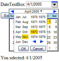
One serious failing of the default ASP.NET Calendar control is its inability to allow for rapid year changes. For instance, in order to select a birth date, which could fall anywhere within an eighty year range, the default ASP.NET Calendar would force a postback for every month change - of which there could easily be several hundred. Not good. The DateTextBox allows selection of any month-year combination through its dropdown control, and this is all accomplished client-side (no postbacks!). Figure 2 demonstrates the use of this dropdown control in Firefox 1.0.
Figure 2: DateTextBox dropdown menu for month-year selection (Firefox 1.0)
All of the DateTextBox’s functionality provides for a truly first-rate customer experience. However, it comes at a small price. The sample page used for Figures 1 and 2, which included a DateTextBox, a Button, and a Label, as well as about 1KB of HTML, weighed in at about 45KB. This includes Viewstate (not from PeterBlum's controls -- they use very little Viewstate) and other ASP.NET overhead, as well as a large amount of Javascript required for the DateTextBox’s operation. This would not be an issue on an intranet or a broadband Internet connection. However, it is a consideration. The User's Guide does offer some tips for how to reduce this overhead, especially for pages that use multiple date package controls, and these tips will reduce the overhead. Compared to the functionality that is provided, the extra script that must be downloaded is pretty minor – about the size of a detailed banner image – but you should definitely keep it in mind if you’re using multiple DateTextBox controls on one of your pages.
MonthYearTextBox
Sometimes, all you need to capture is the month and year portion of a date. The most common example of this is the credit card expiration date scenario. For such cases, the MonthYearTextBox is the way to go, providing a simple drag-and-drop solution. Figure 3 shows an example of the MonthYearTextBox in action.
Figure 3: MonthYearTextBox (IE6)
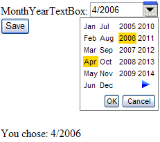
Notice that the minimum year is 2005, and there is no left arrow. This is because I set the minimum date to DateTime.Today. Obviously we don’t want to accept credit cards that have expired. You could do something like this using a series of DropDownList controls, and perhaps some RangeValidator controls, but it would take a lot more code than was required for this solution. The MonthYearTextBox also provides a much better user experience.
AnniversaryTextBox
Similar to the MonthYearTextBox, which takes just Month and Year and omits the Day, the AnniversaryTextBox allows selection of only the Day and Month portion of a date. This is useful for--you guessed it--anniversaries, as well as any other dates that repeat annually. Figure 4 shows an example of the AnniversaryTextBox in action.
Figure 4: AnniversaryTextBox (Firefox 1.0)
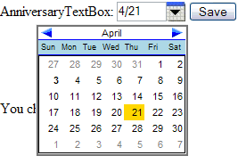
Not much else to say here--it pretty much just works, without the Year.
Shared Features
All of these selection controls include pop-up calendars to provide an intuitive, easy-to-use user interface. However, some applications, such as data entry, are most efficient when the user doesn’t need to take his hands off of the keyboard. Another nice feature of each of these controls is that they provide keyboard filters and auto-text formatting. For instance, if you type an invalid character into the TextBox by accident, it will not even register. And if you decide to shortcut the year to just two digits, it will automatically convert it to the appropriate four-digit year (you can control how this is done). All of this means that data entry operators can use these controls quickly and efficiently. From the User's Guide:
"When the user exits the TextBox, the date automatically reformats to match the xDateTimeFormatInfo [property] rules for lead zeros on months and days, and assign the century when a 2-digit year is entered. For example, if the xDateTimeFormatInfo.ShortDatePattern is MM/dd/yyyy an the user types in ‘1/4/02’, it will reformat to ‘01/04/2002’. You can establish a rule where the month is reformatted into its abbreviated month name instead of digits."
Other useful features:
- Omit the month and year, and today's values will be used.
- Omit date separator characters, and separators will be added automatically. For example '905' will be converted to '09/05/2005'
- Single Key Commands such as 'T' for Today, which can be assigned programmatically
- Built-in support for minimum and maximum dates
QuickDateMenu
One last date-related control is the QuickDateMenu, which can be used in conjunction with any of the above DatePicker controls. You can populate the menu, which functions like a DropDownList, with several common dates or date ranges. When the user selects one of these options, the corresponding DatePicker control (or controls) will be populated with the appropriate values. For example, a common scenario for report pages is to include controls for Start and End dates, as well as a dropdown with common selections such as ‘Last Week’ or ‘Year to Date’. The QuickDateMenu makes this scenario easy to accomplish.
Times and Durations
Less common, but still high up on the usefulness scale, are controls that allow the user to enter a time of day or a period of time. The TimeOfDayTextBox and DurationTextBox fill these roles.
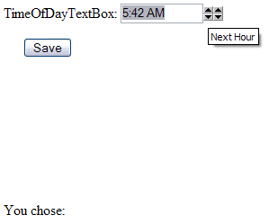
TimeOfDayTextBox
As with the DateTextBox, this control is heavily optimized for data entry personnel. The input is filtered and can be formatted automatically to whatever standard is desired. There are no pop-up commands with this control, but it does support arrows to increment and decrement the hours and minutes. These arrows are optional and are controlled by the xShowCommandButtons property. Figure 5 shows an example of a TimeOfDayTextBox control in action.
Figure 5: TimeOfDayTextBox with CommandButtons shown (Firefox)
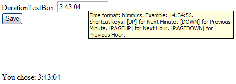
DurationTextBox
If it’s a TimeSpan data type you’re after, rather than a DateTime, the DurationTextBox is for you. It allows hours, minutes, and seconds to be specified in a standardized manner. It’s optimized for data entry, and allows keyboard shortcuts, but doesn’t include pop-ups or extra user interface elements. Figure 6 shows an example, including its tooltip (all of these controls provide such tooltips).
Figure 6: DurationTextBox with ToolTip (IE6)
Integration
One other cool feature of the TimeOfDayTextBox is that it can be integrated with the DateTextBox, allowing them to act as one element for getting and setting full DateTime values. This is done via the TimeOfDayTextBox's xDateTime property. To make this connection, you simply need to assign the controlID of the DateTextBox to the TimeOfDayTextBox's xDateTextBoxControlID property.
Summary
In case it has not been obvious throughout this review, I’m pretty excited about this package. The installation was easy. The integration with Visual Studio made using the controls very easy – just drag and drop. There are few applications I’ve built that did not require some kind of date input. The only thing I would improve on is the out-of-the-box size of the script generated, although this is easily optimized using the advice provided in the User's Guide. The User's Guide itself is a huge point in favor of this package. Compared with many other products, this one is superbly well documented. Finally, Peter provides top-notch support. Join his mailing list (on Yahoo! Groups) and lurk for a while, and you’ll see how quickly he responds to users’ questions and feature requests. It’s also telling that, most of the time, the answers he gives can already be found in the User's Guide.
In this review, I have spent most of my time on the data entry form-type controls. In addition the package includes a calendar control, CS_Calendar, which provides a look and feel similar to, but much more feature-rich than, the ASP.NET Calendar control. Brian Desmond has a screenshot in his review.
Now that I’ve used these controls, I don’t think I’ll ever go back to the ASP.NET Calendar. I had rather hoped that with ASP.NET 2.0, some attention might be given to the ASP.NET Calendar, to add desperately needed features like month and year drop-down selection. However, it doesn’t appear that this will happen, so you can be assured that if you opt to invest in Peter’s Date Package, it won’t be made obsolete by Microsoft any time soon.
Resources
Brian Desmond's Review (Oct 2003)
Originally published on ASPAlliance.com
Tags - Browse all tags
Category - Browse all categories

About Ardalis
Software Architect
Steve is an experienced software architect and trainer, focusing on code quality and Domain-Driven Design with .NET.