Gas Pump UI Failure
Date Published: 07 July 2012

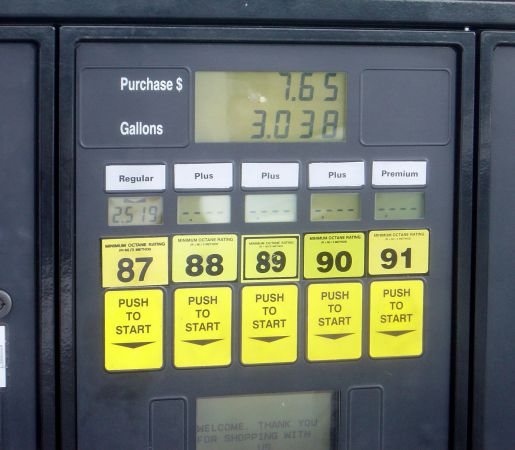
Take a look at this picture (click to enlarge):
What do you notice about the octane stickers? If this were a software application and you were implementing some kind of behavior/click tracking, where are most of the clicks taking place? Since this is basically a touch interface, you can see that the largest “buttons” are the octane stickers. Above them are small headings, but to the user, clearly the big squares look like buttons, as evidenced by the wear on the 87 and 93 stickers (nobody, it seems, bothers to buy Plus).
It’s worth noting that the stickers are not, in fact, buttons at all. Pushing them does nothing. That this is not obvious is evidenced by the wear on them.
As a UI designer, how would you fix this? The simplest solution would seem to be to combine the information from the stickers with the actual buttons used by the interface. If this isn’t feasible, then make the actual buttons bigger and more obviously buttons (perhaps have them stick out, rather than being recessed) and make the sticker values less prominent.
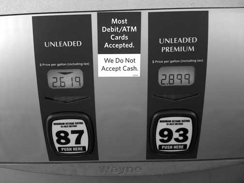
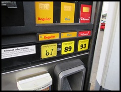
Here’s one example of a better UI that keeps the octane labels but makes more prominent buttons:

Here’s another that I think does the best job, as it uses physically obvious buttons combined with the octane labels and a “Push Here” label:

Users’ experience matters. There’s really no reason to cause your users frustration with your applications’ interface. Most of the application interfaces we develop are not completely novel, and thus a bit of research would quickly show examples of good and bad implementations of user interfaces for a given problem. Spend that bit of time doing such research. Your users may thank you. More likely though, they simply won’t curse you and your application, which is still a victory for you and your team.
Tags - Browse all tags
Category - Browse all categories

About Ardalis
Software Architect
Steve is an experienced software architect and trainer, focusing on code quality and Domain-Driven Design with .NET.

