Excel Cumulative Flow Diagram
Date Published: 12 February 2012
I’m working on a Kanban Fundamentals course that should go live soon on Pluralsight. One of the topics I’m touching on is Cumulative Flow Diagrams, and how these can be used to analyze flow of a process. Some electronic kanban tools like AgileZen have some built-in support for CFD-style reports, but for instructional purposes it’s nice to be able to create one on-the-fly with whatever data one needs to illustrate a point. And of course, if you’re not using any fancy tools but would still like to benefit from the insights a cumulative flow diagram can provide, it’s nice to know how easily one can create one using Excel.
I’ve created a sample you can download and modify for your needs. This will of course be the fastest way to get started:
Sample Excel Cumulative Flow Diagram Worksheet and Chart
Creating a Cumulative Flow Diagram in Excel
To create your own cumulative flow diagram in Excel, simply create a worksheet with a column for the date, and columns for each of the states in the process you are modeling. For example, if your software development team’s process has tasks moving through states of Ready, Develop, Test, and Deployed, then you might create an Excel worksheet with columns like this:

Next, begin collecting data. At a particular time each day, and at the same time each day, note how many stories, cards, tasks, or whatever you’re using in your system to represent active work items are currently in your system. Record how many are in each state. Pay no attention to which ones, specifically, are in each state – a CFD is an aggregate tool and doesn’t focus on individual work items. After a few days, you should have some data like what’s shown above.
Once you have some data, you can create a cumulative flow diagram in Excel using Excel’s built-in charting capabilities. Simply highlight all of your data and the headings, and select Insert – Charts – Area – Stacked Area as shown here using Excel 2010:

By default, you’ll most likely get a chart that puts Ready on the bottom and Deployed on the top:

By convention, CFDs are set up so that time flows from left to right, and we achieve this by ensuring that the order of the states is such that the earliest states appear at the top and the final state appears at the bottom. You can rearrange the order of the data in your chart by right-clicking on it and choosing Select Data. Then use the arrow keys in the Legend Entries (Series) box to reverse the default ordering of the data series:

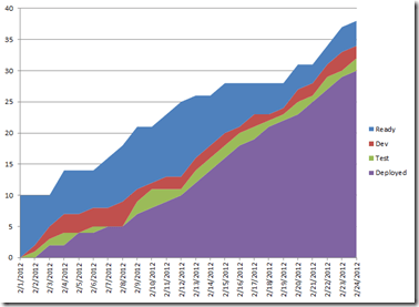
When you’re done, the data in the Legend Entries should be ordered Deployed, Test, Dev, Ready, and your chart should look something like this:

You can analyze your flow using a CFD by measuring vertical and horizontal distances within the chart. For instance, in the chart above, if we look at the vertical distance of our activity states (Dev and Test) on 3 February, we can see that we have only 3 work items in process (work-in-process, or WIP). We can also see that our Test activity is outpacing our Dev activity later in the month, with 0 WIP items on the 5th, 7th, and 8th of the month, while the Dev WIP has grown to as high as 4 items. This is identifying a bottleneck in our flow, which at this point is the Dev process.
If we analyze the diagram by measuring horizontal distance, we can determine how long it takes for a work item, on average, to make it through our process. Depending on what you’re trying to do, you may start the clock when an item enters the Backlog, or your Ready queue, or when you actually begin work on the item. For simplicity given the small dataset I’m showing here, let’s say we’re only concerned with the time it takes an item to make it through our Dev and Test activities. Once more if we look at 2 February and measure from the top of the red Dev area horizontally to the right to the top of the purple Deployed area, this will tell us approximately how long items are taking to be deployed that were begun on 2 February.

In this case, we see the cycle time is just 1 day. However, if we do the same thing for items which were begun on 3 February, we find that these were not completed until 7 February, or 4 days. Since this is just the beginning of our project and we’re still ramping up, this most likely isn’t a huge area for concern, but if you find a 300% increase in your cycle time in a mature process, it’s definitely worth investigation.
Summary
Cumulative Flow Diagrams can be a useful tool to use when analyzing flow of work through a system or process. While there are tools that can produce these charts for you, you can easily create them yourself using Excel, as shown here. Feel free to download and modify the sample Excel cumulative flow diagram file. If you found this helpful, you may wish to watch my Kanban Fundamentals course on Pluralsight.

About Ardalis
Software Architect
Steve is an experienced software architect and trainer, focusing on code quality and Domain-Driven Design with .NET.